Digital banking services have significantly grown in recent years, especially during the COVID-19 pandemic. According to ResearchAndMarkets.com, the global mobile banking market is expected to grow to $30.1 billion by 2026. People use banking apps because it allows them to make all transactions without leaving their home, save time, and avoid long queues in the banks. To motivate customers to use your product, you need to work hard on financial app design.
Today, we will tell you how to create a finance management app that will draw the attention of the population.
written by:
Elizabeth Starikova
UX/UI Designer, Qulix Systems
Digital banking services have significantly grown in recent years, especially during the COVID-19 pandemic. According to ResearchAndMarkets.com, the global mobile banking market stood at $12.1 billion in 2020 and is expected to grow to $30.1 billion by 2026. People use banking apps because it allows them to make all transactions without leaving their home, save time, and avoid long queues in the banks. To motivate customers to use your product, you need to work hard on financial app design. Today, we will tell you how to create a finance management app that will draw the attention of the population.
Contents
Why Is Finance Mobile App Design Important?
First of all, it should be noted that the finance app design is not just about beautiful colors and buttons. It includes two components, known as user experience (UX) and user interface (UI). UX design is responsible for the intuitiveness, navigation, and ease of use of the interface, while UI design covers the issues of the appearance of the banking app.
Good UX/UI design improves user experience, increases competitiveness, and attracts new users. Forrester found that a well-designed user interface increases conversion rates by more than 200%. If a user likes your finance mobile app, they will definitely recommend it to their friends and relatives. Research also shows that 23% of customers who had a positive experience told 10 or more people about it. That's why UI/UX designers should thoroughly work on your project.
The finance mobile app design has its own nuances as it's created based on user behavior and covers their needs and wishes. There are various types of fintech applications that are used to manage funds, view invoices, and make payments. They allow you to improve and automate financial services with an easy-to-use interface.
Many people think that financial apps are boring and identical, but it's a wrong opinion. They may have a different target audience; therefore, these products will solve different business tasks and serve various objectives. For example, if the main users of your solution are young people, they will appreciate the ability to pay with a fingerprint or FaceID, but the same is not true of the more conservative older generation.
In addition to new-gen features, always remember about the appearance of your app. UI design is important because young users want to have finance mobile apps that look modern and vivid. Follow the design trends and don't be afraid to experiment. Older customers who got used to conventional applications also would like to use a stylish and attractive finance app. Thanks to a non-boring and modern design, your product will stand out from other banking applications and attract its potential audience.
Developing a Personal Finance App: Top 6 Design Principles
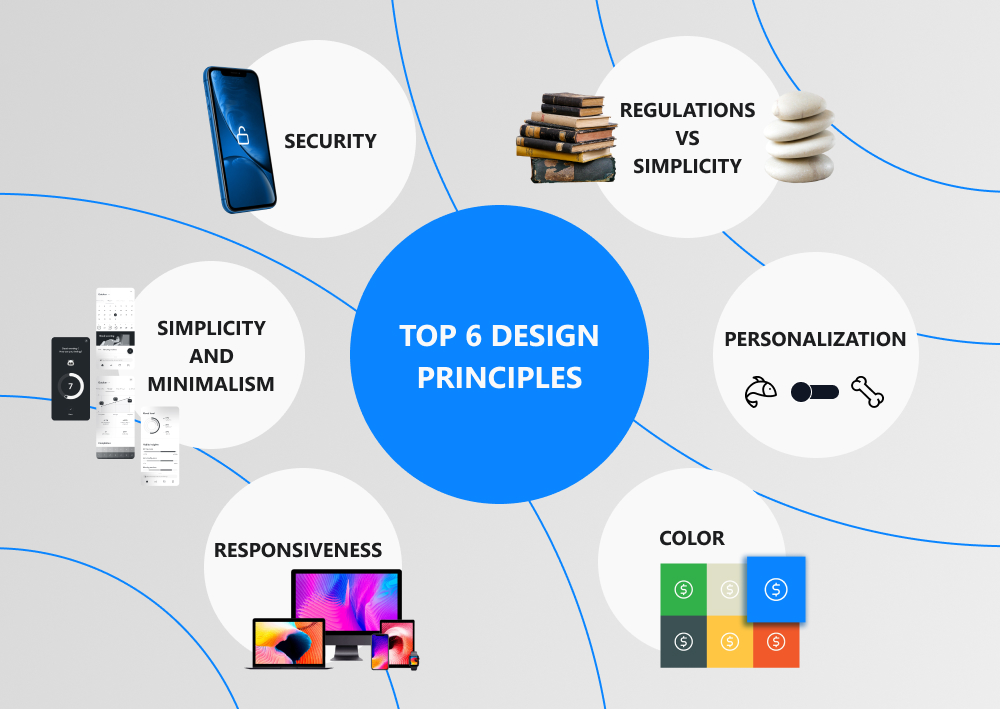
So, what should you keep in mind when designing a banking app interface? We identify 6 key requirements for the best mobile banking app design:
Simplicity and Minimalism
According to Hick's Law, the more options a user has and the more complex they are, the more time it takes to make a decision. A visually complex UI design scares people away and makes them uninstall the app. Therefore, don't overload them with complex functionality and unnecessary elements as such an interface reduces engagement and brings fewer conversions compared to simpler analogs. Let your customers make their transactions in the financial app in as few simple steps as possible.
Too many elements, banners, pop-ups, and animations make the user think too long about the next steps, causing annoyance and confusion. Reducing functionality will allow your customers to make decisions faster and focus on completing the actions for which they downloaded and installed the app. The simple and minimalistic design helps people better see the main elements of the interface, which makes the user interaction intuitive and concentrated.
Responsiveness
Every financial app has an important feature that designers should always keep in mind. It contains a lot of figures and other information. We all know that people don't like to read huge sheets of text with numbers, so the developers of banking apps use various data visualization tools to transform large amounts of data into simple and understandable graphs and tables. Responsive design will allow your product to display them properly on different screens, from a huge monitor to a smartphone.
Today, people prefer to use smartphones and tablets as it's very convenient. They allow you to open a banking app and make transactions anywhere - at home, on public transport, on the street, and so on. Solutions that are not tailored for small screen devices are losing mobile users. Responsiveness adjusts your finance app to fit the screen size of your devices and properly places all the information you need on it.
Color
Color is an essential component of user interface design that helps developers and designers establish an emotional connection between the user and the product. According to research, color affects the decision of 60% of people to use or uninstall an app. A number of studies and surveys, in which designers, psychologists, sociologists, marketers, and other specialists took part, showed that different colors cause the following associations in people:
Green: health, order, money, nature;
Blue: professionalism, technology, innovation, serenity;
Red: strong emotions, hunger, energy;
Yellow: warmth and amiability; please, note that this color can quickly cause eye fatigue;
White: innocence, purity, and order;
Purple: success, wisdom, and wealth;
Brown: reliability, earth, pragmatism, boredom;
Orange: enjoyment, warmth, warning, enthusiasm.
For example, many financial applications use green, which many users associate with money and growth. Many developers and designers of mobile banking apps prefer blue and white colors as well. At the same time, bright colors will help you liven up your finance app and make it more exciting. With color, you can make your solution unique and personalized, as well as prevent it from getting lost among multiple competitors.
Revolut, as a good example of a successful financial app, uses colors and color shades for currencies, options, and accounts differentiation. Various grey scale shades help users notice important text messages and explanatory instructions. On the flip side, loud pink is used for alerts and calls to actions. Rather unconventional, right?
When choosing a color for your future finance management app, remember about the country and culture in which your solution will be used. For instance, purple in Western cultures is a symbol of piety, high society, and faith, while in Thailand and Brazil it is a mourning color.
The Balance between Regulations and Simplicity
Banking apps must comply with many regulatory requirements. For example, when registering, users must go through the Know Your Customer (KYC) procedure and provide other necessary personal data. Despite the fact that we've mentioned above that the interface should be simple and the registration process should be fast, sometimes it's impossible to fulfill this requirement due to legal provisions. This can lengthen the registration process as users have to enter personal information, including name, date of birth, telephone number, residential address, and so on.
According to Miller's Law, the average person can retain about seven elements in short-term memory. Most users find it difficult to work with a large number of elements. UX/UI designers can break the registration process into multiple steps to allow the user to focus on one task. This will make the long registration process not so boring and annoying, and the user will be able to concentrate on questions and answers.
Personalization
Competition in the banking app market is constantly growing and making development companies invent new ways to interest and retain users. Personalization is one such way. It helps designers and developers anticipate the needs of a particular customer.
According to an Everfi report, 89% of customers of financial institutions make their choice based on how well financial apps incorporate personalized experiences. So, it’s also crucial for financial app designers to create the best adaptable interface for users.
For example, they offer people to choose a dark or light theme, the ability to customize the main screen for their tasks using the block selection function and have access to the desired products faster, the ability to add various bank accounts, social network accounts, and other to their apps.
Security
Banking apps deal with the personal data of clients. Accordingly, they must protect personal information and ensure secure financial transactions. Companies building fintech applications must follow the security by design principle, test all potential vulnerabilities, and implement proven measures to provide safety.
The security by design principle allows you to eliminate many risks at the initial stage and increase the chances of your business reaching high financial performance and success in the market. For this purpose, apply the measures, such as two-factor or multifactor authentication, SDL methodologies, best practices and standards for secure development, data encryption, and others.
Our Tips for Designing a Perfect Banking App
As you can see, the finance app design principles are almost the same as for any application. They should be native, intuitive, responsive, attractive, safe, and easy to use. We've compiled a list of dos and don'ts for you to guide your designers while working with the app.
Dos
- Limit the number of functional elements so that users don't get confused in steps. Try not to include more than 5-7 elements in one functional block. If your app has a lot of features, group them into categories. This usually looks like a large dropdown menu or multiple tabs.
- Divide information on the screen into logical blocks to make it easier for the user to perceive large amounts of data.
- Visualize information. Use more graphs and tables and avoid tons of figures and texts.
- Use simple interfaces to make it easier for the user to select the desired function.
- Highlight all key interface elements. For example, a user profile, login form, and feedback form should be placed on the main screen of the finance app.
- The information should be presented in a clear and simple manner. Don't use complex financial terms.
- Use familiar design patterns for your platforms (Android, iOS, Windows Mobile, etc.). Nevertheless, you can be creative within reasonable limits and follow modern UX/UI design trends.
- Follow the three-click principle. To go from one section of the application to another, the user should only need 3 clicks.
Don'ts
Now, let's see what mistakes should your designers avoid when designing banking apps:
- Don't be too creative when it comes to personal finance applications. In chase of unusual design solutions, don't forget that fintech products should remain strict and not overloaded with unnecessary details.
- Don't use too many push notifications. They should contain only important information.
Final Word
So, on the one hand, the banking app design is no different from the design of any other application. Users need simple and intuitive products that will help them accomplish their tasks easily and quickly. On the other hand, the development and design of such solutions require care and consideration of some nuances.
Banking apps should be user-friendly and modern, so you can take a closer look at some of the banking app design trends. For example, you can use biometric authentication, which will increase the security of your product and free users from the need to invent, remember, and enter complex passwords. You can also pay attention to voice navigation and the implementation of AI-based chatbots. This will help you reduce the burden on your customer service staff because chatbots can answer numerous frequently asked questions.
If you would like to learn more about finance app design trends or practices, the Qulix Systems specialists are ready to help you. For more details, please visit our website or get in touch with our support team.

Contacts
Feel free to get in touch with us! Use this contact form for an ASAP response.
Call us at +44 151 528 8015
E-mail us at request@qulix.com


