A clear-cut SaaS design can pave the way for the success of your project, yet many people still underestimate the psychological impact of a thought-through and beautifully executed user journey. It doesn't just positively affect people’s mental well-being by providing solutions to user problems — it possesses the power to make them choose you. And that is exactly why UI/UX design of SaaS websites defines who's to stay in the SaaS market (which, by the way, is an exceptionally competitive stage: according to Exploding Topics, there are currently about 30,000 SaaS companies).
So, what design elements can you implement in your SaaS platform to make your key features stand out and conquer the hearts of the customers? Let's find out!
written by:
Elizabeth Starikova
UX/UI Designer
Contents
What Is SaaS Design About?
Software as a service, or SaaS, is a software distribution model that lets people access and use cloud applications over the Internet, mostly, via a web browser. That's why you don't have to install them on a device, and there's no need to purchase a license: you simply rent programs with a pay-as-you-go pricing model, a.k.a. subscription fees. Netflix, Spotify, Dropbox, Slack, Office 365, Buffer, and Salesforce are all software-as-a-service companies (that also provide great SaaS design examples!).
There are two facts we'd like to introduce you to:
- SaaS applications make up 70% of total company software use (Exploding Topics);
- Around 99% of firms depend on at least one SaaS solution for running their business (SaaSworthy).
Considering how easy, efficient, and convenient SaaS platforms are, this information isn't even that surprising. Yet, it is another sign to dive deeper into the waters of SaaS website design.
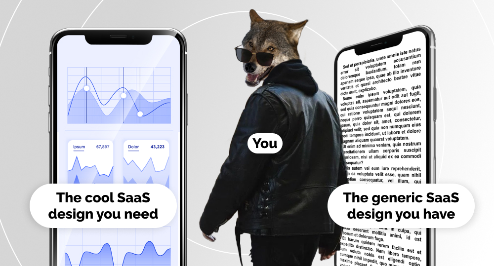
“Why should I care about it, though?” you may ask. “My platform gets plenty of views as it is.” The answer is simple: the best SaaS website design is the strategic one. It has to boost activity beyond attracting the traffic. So, yes, it has to possess a visual appeal, but its goal is to offer a superb user experience that is going to convert visitors of your web page into leads and potential customers.
If you want to craft great SaaS design, best practices of this artistry will help you achieve your goal:
Easy sign up
No need for detailed and lengthy forms of registration: they turn people off. Keep it short. SaaS websites allow to gather user analytics in real-time, so you will have a chance to get to know your crowd better moving forward.
Smooth onboarding
Introduce the unique identity of your SaaS company to your customers: teach them how to work with the important features that drove them to give your product a chance. Make sure that your SaaS web design provides users with the ability to skip certain onboarding steps and customize the application by asking them about their needs and habits.
Intuitive interface
Users should be able to navigate the main elements of your SaaS website with ease: this well help them — literally — see why they're paying for your services. Implement a clear hierarchy they can figure out intuitively. E.g., take proper care of the SaaS dashboard design (your front page has to contain a dashboard with all the useful links) and a horizontal or a vertical slide column that might be the route to the menu bar.
Clear design
Ask the design team to keep it simple and minimalistic. You don't want people to get tired of the color palette or the excess of graphic elements. Declutter, use bright colors for call-to-action buttons or menu navigation, and use different font sizes and bold typography to reflect the significance of various content sections. Also, keep in mind that a clean design helps get higher SEO rankings.
*If you'd like to get assistance with your SaaS website (be it a B2B SaaS design or a B2C SaaS design), we provide UI and UX design services. Just saying!
Since the topic of the best practices has been successfully covered, we can move on to another crucial discussion. How can you make your product design memorable and captivating? What elements can you add to hold user attention, deliver product value, and attract just the right people? The key to all these questions lies in UI/UX trends of 2024.
Turning Tables: UX/UI Design Trends
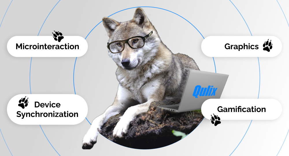
Graphics
SaaS websites contain a lot of information, which means that we have to find creative ways to present it: it's 2024, and no one is going to break through long reads on your landing page. If your content seems too one-dimensional and indistinct at first glance, website visitors aren't going to give it a second try.
That's when data visualization enters the room: you can utilize graphs, diagrams, and animation to navigate the visitors through your products, help them digest the information, and understand the flow of your SaaS platform. Make it fun!
Gamification
Speaking of fun — make your app interactive with gamification. And it doesn't matter whether we're talking about B2C or B2B SaaS website design.
Gamification is the implementation of game mechanics in non-game environments, in our case, SaaS websites. Its goal is to increase user engagement and motivate customers as well as partners to interact with your product more.
Gamification is exciting and rewarding, in both SaaS app design and in general, and it brings users a sense of achievement. It cheers us up — that's why we like it. To prove it with facts, the TalentLMS research explored how gamification elements in training and work software affect the emotional state of employees. The company found that, “Employees say gamification makes them feel more productive (89%) and happier (88%) at work.”
You may think that gamification isn't the best fit for your SaaS website, since you don't plan to create leaderboards and reward your users with badges and trophies. However, gamification is more than that:
- You can implement a progress bar and/or a checklist in your registration or onboarding process to give users a sense of time and satisfaction once they fill the bar;
- Additionally, a good SaaS website always provides a customization option, and a checklist can help your users do that: it prompts to choose a background color, widgets, and so on;
- Celebrate your customers' checkpoints! If they started exploring a new feature or have spent a month with you, give them a little cheer and on-screen confetti. This will bring your audience a sense of achievement, increase their loyalty, and lighten up their mood. And all of these things will help you realize: yep, you've created a great SaaS website design!
Microinteraction
As the name implies, microinteraction refers to all the subtle ways of interaction with a SaaS platform: swiping, scrolling, clicking, pressing a button, using emoji as a response to your question, etc. In other words, these design elements increase engagement and make the environment more than just user-friendly: it becomes more responsive, fast, and welcoming.
A good thing to remember here is that you shouldn't add new features to your SaaS application design just for the sake of novelty. Ask yourself, “Will animation here make sense, i.e., simplify user experience, or is it here just to make things prettier?” If it's the latter, then don't go for it.
Also, keep in mind that the more animated elements there are, the longer your website will load. New visitors will not wait for a whole minute to see that happen, so be reasonable about it, especially if we're talking about your landing page.
Device Synchronization
If you have both an iPhone and a MacBook, you know that when you use the apps installed on both devices, and both are online, you can switch between them. For example, if you access the Internet via Safari on your iPhone, your computer will prompt you to continue searching on your MacBook where you left off on your phone. Applications like Netflix and Spotify offer the same opportunities: as the truly marvelous examples of the best SaaS websites, they allow you to watch your favorite shows or listen to music on various devices without a halt. This is what device synchronization is, and for SaaS products an ability to conveniently access the same data and features from mobile devices, tablets, and laptops is a must. It makes people's lives easier, thus, user experience gets better.
UI/UX of Your Success Story
SaaS website design can take your business to the next level: it helps you reach your target audience more precisely and provide a better customer experience. And to build the best SaaS websites, you need the best UI/UX design. So keep up with the trends, be reasonable about the canvas of your product, and climb that success ladder!
If you want to get advice on how to climb it faster and have more spring in your step, contact us! SaaS homepage design, SaaS landing page design, SaaS database design, SaaS architecture design — whatever SaaS UX design you need, we'll be glad to assist you.

Contacts
Feel free to get in touch with us! Use this contact form for an ASAP response.
Call us at +44 151 528 8015
E-mail us at request@qulix.com
