Let's continue our journey into the approaches you can apply to engage youth audience. Check some more tips on the importance of UI/UX, safety and security, and the customized attitude towards your users.

written by:
Alexander Arabey
Director of Business Development
In the first part of this article on lifestyle and mobile banking:
- we used a lot of statistical data to back up our focus on the lifestyle banking trend
- specified millennials as the target audience
- accentuated the promotion of bank’s mobile channel
- provided some insights on how to improve the mobile bank functionality
- and explained why building an engaging customer experience should be a priority for financial organizations today.
#4. UI/UX
By communicating with bank professionals I realized that many of them think of the app development in the following manner: first, consider the functionality and then proceed to the UI/UX. The effectiveness of such an approach is arguable.
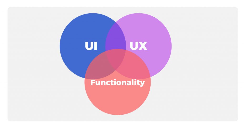
In fact, the boundary between UI/UX and functionality isn’t strict. Usually, UI/UX is perceived as something about the app interface, while functionality is considered as app capabilities. However, a lack of a specific function can be a tangible UI/UX issue.
For example, by automatically defining the mobile network provider banks can skip an unnecessary user action in the payment process. Also, it is difficult to list all of the available providers and make the selection convenient from the UI/UX point of view. Although it is primarily a matter of functionality, and not an interface, adding a new feature can brush up on the interface.
It may seem that the greater functions the app has, the more convenient it should be, as theoretically it allows fulfilling more tasks. However, the direct proportion doesn’t work in this matter. There is some breakeven point, after which an abundant amount of functions causes difficulties. It may become more complicated to build the navigation structure or to come up with a clear section title so that users can find it. The optimal sequence of actions, clear fields, their names, hints to them, error messages, titles and locations of controls should be designed along with the functionality development. Otherwise, the app falls under the risk of becoming a meaningless bunch of features.
This way we support the idea that UI/UX and the functionality shouldn’t be separated. At this point, a question pops up: how to implement this approach? This is what you should discuss with the vendor: team communication, creation of shared information space and analysis of competitors to consider best practices and avoid mistakes.
From the vendor’s perspective:
The easiest method to evaluate the UI/UX of the financial app is to select major operations, you want to ease up. For example, utility payments or P2P transfers. It is enough to analyze how 5-8 users from your target audience perform these tasks in the app to see how the interface can be improved.
To speed up the UI/UX testing you may use First Click Tests (FCT). During such tests, users view one screen and answer only one question. For example: where are you going to search for deposits? It was found out that if the initial click is correct, then the probability of successful task completion is approximately 87%. If the first step turns out to be wrong - the success rate drops to a whopping 46%. The test is performed to reveal UI/UX deficiencies that may require additional examination.
#5. Сustomer data and security
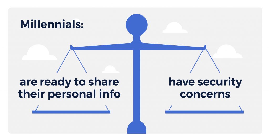
On one hand, being so tech-savvy and socially engaged, millennials are used to sharing their personal information. They would prefer simple registration forms and show little understanding of why the bank complicates the service due to security standards.
On the other hand, security concerns are the most common mobile-banking barriers (according to the opinion of 53% of global respondents). What’s more, large-scale research says that compared to other generations, millennials are 2-3 times more likely to appreciate mobile app notifications for credit limit warnings, suspicious activity alerts, and payment reminders.
Make use of both facts:
- Collect personal data to provide an exceptionally personalized level of service: keep in mind, over half of millennials are ready to share their areas of interest to get more customized recommendations. By the way, this sets millennials apart from older generations: only 41% of baby boomers would share their personal information for more personalized service.
- Provide enough security features without complicating the user experience. For example,
- Device fingerprinting (the unique combination of signals received from the device: IP, location, device type, type of user actions and other). The system is developed by the software vendor to optimize the anti-fraud audit.
- Multi-factor authentication: in addition to the login-password request, software developers help implement biometry and/or PIN authentication or add session passwords according to the bank’s functional requirements. The same options can be used for confirming in-app operations and can be customized. For example, a session password is required only for certain type of payments.
- Implementing SIEM (Security Information and Event Management) systems to identify risks and suspicious behavior patterns, for example, if the device is rooted, if there are too many unsuccessful login attempts and so on.
- Real-time alerts with customized settings.
From the vendor’s perspective:
To deal with the emotional aspect of arising security concerns, some banks released an idea of proactive customer education. Fear of hacks and data breaches creates a great amount of discomfort for sharing personal information with the financial app. While banks continuously monitor possible threats and vendors implement new security technologies, it still makes sense to educate customers on how to alleviate risks.
For example, Tinkoff bank stories within the app kill two birds with one stone: they promote the lifestyle banking strategy by informing users about new products, features, and trends as well as providing snack-size tips on fraud protection simply and clearly.
#6. Personalization
It’s difficult to argue that online banking functionality has almost reached the limits of desktop computer capabilities. The same is likely to occur with mobile apps in the near future until a hi-tech breakthrough takes place and some brand-new devices appear on the market.
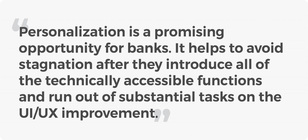
When payment automation, biometry-based authentication and other new (for now) features become nothing special, customer-oriented personalization will replace market segmentation and expand the horizons of digital banking.
In software development projects we noticed that banks become more attentive to personal user data and start considering ways of using it. In addition to basic data on income and expenses, banks will soon be able to analyze customer lifestyle (preferred kind of entertainment, sports, and habits). The idea is to proceed from a fixed product range to the flexible set of unique offers based on prior customer experience and avoid irrelevant offers. It’s pretty sad to realize that despite poor targeting efforts of the banking industry, about 75% of customers are still awaiting additional offers from their banks.
For example, in the era of personalization, runners can be offered cashback at sportswear stores, while parents will get promo offers from frequently visited play centers for kids. The number of personalized combinations can be almost unlimited, and that’s the key difference.
The personalization can be extended to financial habits formation, for example, cutting expenses, achieving financial goals and improving daily activities (like spend more on fitness or save up a planned amount each month). It also naturally addresses the issue of financial education: banks can share best practices on dealing with finance.
From the vendor’s perspective:
In my opinion, in the future, digital banking apps will become AI-driven and full-fledged financial assistants you can communicate with via a voice interface. Such assistants will be able to stay proactive, offer valuable insights and personalized products.
Final Takeaways
To sum it all up, here are potentially successful strategies that banks can use:
- Adding minor functions improving the interface convenience - for example, proceeding to payments from the card screen or repeating the payment from the history. Don’t forget about security improvements.
- Experimental features, which create new scenarios of mobile app use - integrated messengers, voice assistants, shared accounts and more. Navigation and the look of the interface should be considered at each stage. Unfriendly apps are abandoned, no matter how functional and useful they are.
- Experiments with personalization instead of market segmentation to build trust and an emotional bond.
- Value-added integrations - make use of fine P2P payment services or third-party budgeting apps. Creating versatile bank-branded experiences will help to reshape the bank positioning and is actually what lifestyle banking is about.
- Continuous delivery - the work on the updated version of your app starts at the moment the previous version is released or even earlier. Short and effective software development iterations can help you timely react in time to customer needs by making use of their feedback. It is realistic to build new app versions within weeks, not months.
As a software vendor, we set ambitious goals: with the help banking and fintech software development, we strive for improving customer experience. Qulix Systems promote digital and lifestyle banking as concepts that can ease-up financial decisions for customers and add comfort to their routine tasks.
Contact our experts at request@qulix.com to discuss software development for banks and fintech organizations.

Contacts
Feel free to get in touch with us! Use this contact form for an ASAP response.
Call us at +44 151 528 8015
E-mail us at request@qulix.com


