If you’ve been following a seemingly right mobile app marketing strategy, but it all goes wrong, you surely need a help from an expert. Read our new article on the app marketing mistakes and see what you have been doing wrong.

written by:
Veronica Chizh
If you’ve been following a seemingly right mobile app marketing strategy, but it all goes wrong, you surely need a help from an expert. Read our new article on the app marketing mistakes and see what you have been doing wrong.
Over a half of the global population is online today, according to Internet World Stats. At the same, the half of this half goes online using their mobile devices. The volume of mobile traffic ( i. e. the number of mobile traffic consumers) has more than tripled since 2013 – from 16 percent to 52 percent in 2019. Given that, if you are still doubtful as to whether you need a mobile version of your website or an app, it’s high time to say yes to the Mobile apps industry.
However, if you’ve already tried to launch your app and it ended up in a failure or are yet to join the industry, you may have been unaware of certain rules that the mobile apps industry plays by. These include design and planning, development, testing and QA principles to follow. Nevertheless, today we will talk about the problem that many app developers turn a blind eye to and this is app marketing mistakes, for even stunning apps may go unnoticed by the public without a proper marketing strategy in place.
To give you a broader picture of what you may be doing wrong, we added up some technical issues to the marketing ones (on testing and design) that may ruin your marketing endeavor as they have a direct impact on the look and feel of your product (which is what you sell, in the first place). Study them all and ensure a long life for your app in the market!
1. A generic attitude
The best ideas can be ruined by a generic attitude for the project. You may have come up with a brilliant set of features, but they may seem not that brilliant to a half the people you share them with. Does it mean your brainchild isn’t a great one? No, you simply shared it with the wrong people.
This can be you biggest app marketing mistake to stop trying after receiving criticism from some people. What if your app goes unnoticed by senior citizens but works out great in the case of the teenage population? Should you be OK with it? We dare say, you must be very fine with it. Look at TikTok, for example – a social platform showing one of the most impressive growths in the media industry with 800 million active users. They don't worry for not being that senior-friendly with above 40 percent of its users being aged from 16 to 24. As Oberlo puts it, It might be a bit of a head scratcher for the older generations, but TikTok is no news to the teens of the world.
So yes, you may not appeal to all the possible population categories, but focusing on your target one and placing their needs above the rest will be a winning ticket for you. Are you still planning to impress each and every person with your app to give it a broader coverage? You’d better reconsider your priorities, or you risk losing any coverage at all.
2. Poorly planned monetization strategy
You surely don’t think that investments will pay off in a twinkling of an eye. If not, this is your app marketing mistake No.2. Even in the case of a most beautifully crafted app delivered by the talented software developers, it takes months to get your money back. However, this statement is false in case of the industry giants whose updates are been looked forward by millions of wholeheartedly devoted fans. Like these ones, for instance. If you’re not among them, build your monetization strategy carefully and go on reading.
So, what app marketing aspects you could miss when building your monetization strategy? Firstly, not to consider the global economic environment. Surely, you can choose the highest from the 94 price tiers in the Apple App Store for your app, but who would buy it? On average, users pay around $90 yearly on paid-apps and in-app purchases. Thus, you should attach the price tag to your app with this figure in mind.
Second goes excessive pop-ups and advertising. These are a sure way to add up some dollars to your budget, but only when used in a controlled dosage. Let’s say, what would you do if during a round of a game you had to fight off the pop-ups every 15 seconds? No doubt, you’d be terribly annoyed and soon stop playing or delete the app at all. Your potential users would do exactly the same thing, if you choose to insert too many pop-ups in pursuit of their wallets.
Same story with advertising. No one loves irritating ads. Thus, when introducing these elements into your monetization strategy, make sure you won’t tick your users off instead of bringing your investments back.
3. Cluttered, complicated design
You may think that design has little in common with marketing, however this is not so. On the contrary, the more selling your product looks, the higher the chances it will be sold. Superb functioning always finishes second in this race.
So, how to build stunning and selling designs?
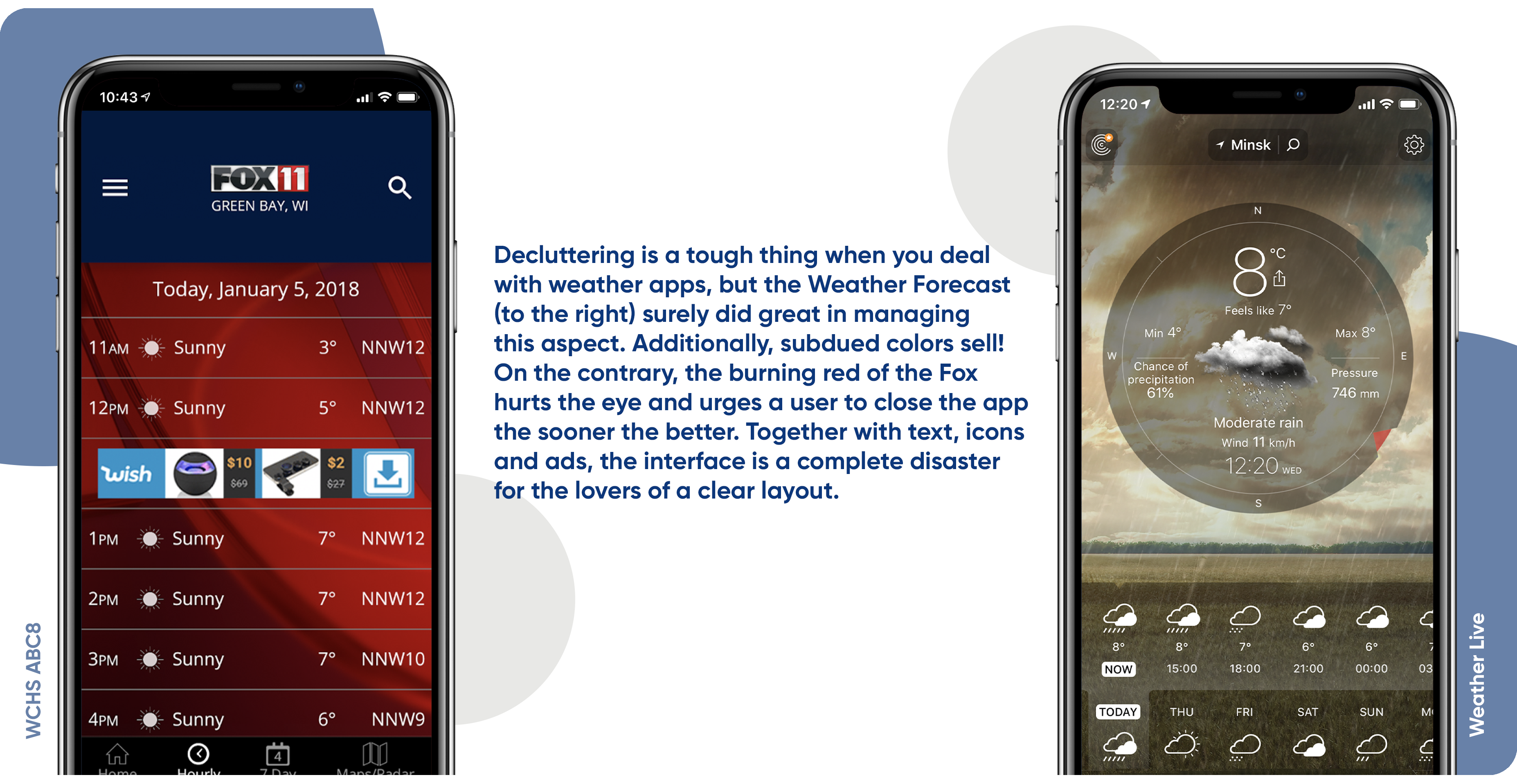
Rule #1 for a cute app design is Simplicity. Stick to it, thus reducing the overall cognitive load on the users. Although cognitive load isn’t entirely avoidable, designers must strive to manage and accommodate these limits, Marvel says.
Thus, first thing to remember when building a killing design is to ensure decluttering. The less text/elements/pictures/accents, the better. Second, don’t overplay with the layout. A non-standard layout won’t impress your users, as it increases the learning curve and makes the app less intuitive. By the way, iOS apps undergo strict interface and layout control, so you simply won’t get to the Apple App Store if your app looks and feels non-iOS.
To make it even easier for your audience to fall in love with your brainchild, help them study it through unfolding and engaging, visually appealing (and better animated) walkthroughs. These will work out better than posting tons of text on the page.
4. Lousy testing
It sucks when an app literally makes users cry with its beauty, but is actually ill-tested. Nothing can be as discouraging as that. If a poorly tested app gets to the market, word of mouth will speak louder than a thousand billboards or targeted ads during a marketing campaign.
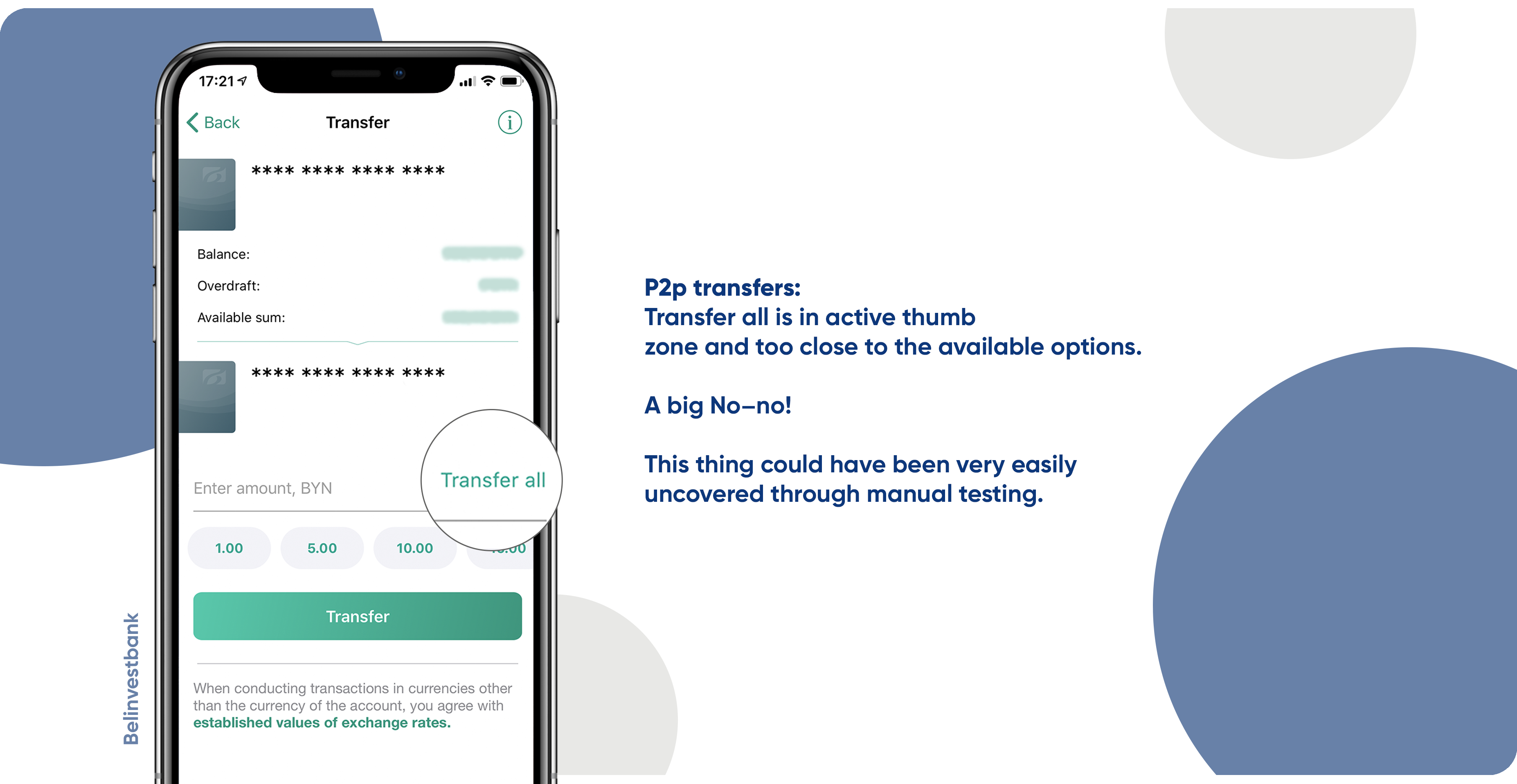
So, once you set your mind on giving your app a fabulous design, be sure it will function as breathtakingly. To ensure that, try crowd testing with expert agencies picking for you the best testers from your potential audience. Don’t overplay with test automation, especially don’t rely too much on the controlled environment. Remember to employ best manual testing practices and try various real devices, though the idea to emulate everything may sound nice.
Invested already enough and left no extra bucks for a cute test of a cute app? How much will skipping of the test stage cost?
To have a better idea, let’s leave apps market alone and recall P&G’s case, when they failed to localize Puffs before landing into the German and UK market. As they found out later, the name of their facial tissues stood for brothel in German translation and was a rude referral to a homosexual in English translation. The whole story didn’t end up as a market hit of the century, after all.
Morale: test at your best!
At the end of the day…
Yours can be a simple app, nothing extraordinary - one more food calculator or a budget planner. Yet, if it has a nicely planned airy design, appeals to its targeted audience, is a well-tested and a budget-friendly one, it will conquer the market hands down.
Need more on UI/UX, monetization strategy, successful onboarding and increasing conversion rates? Contact our Support team or visit our website for the details.


